Cleary’s Bookstore
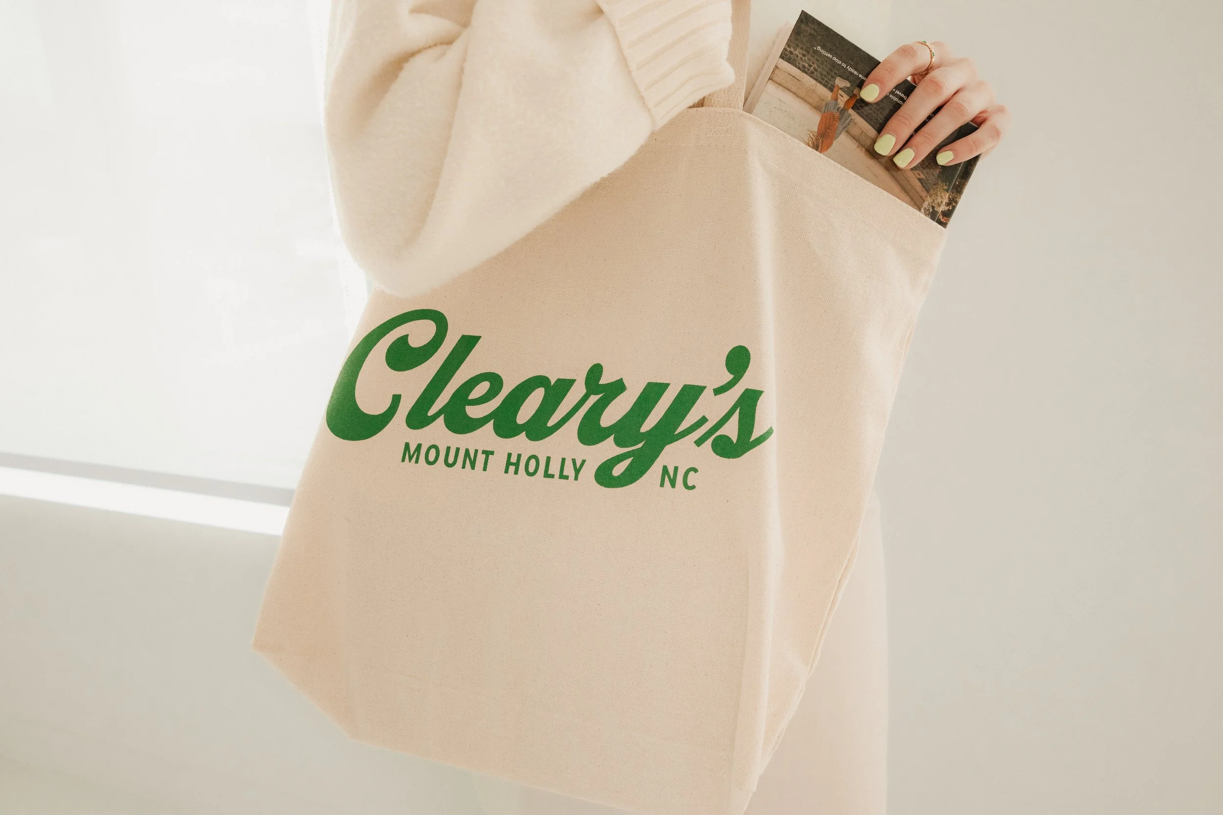
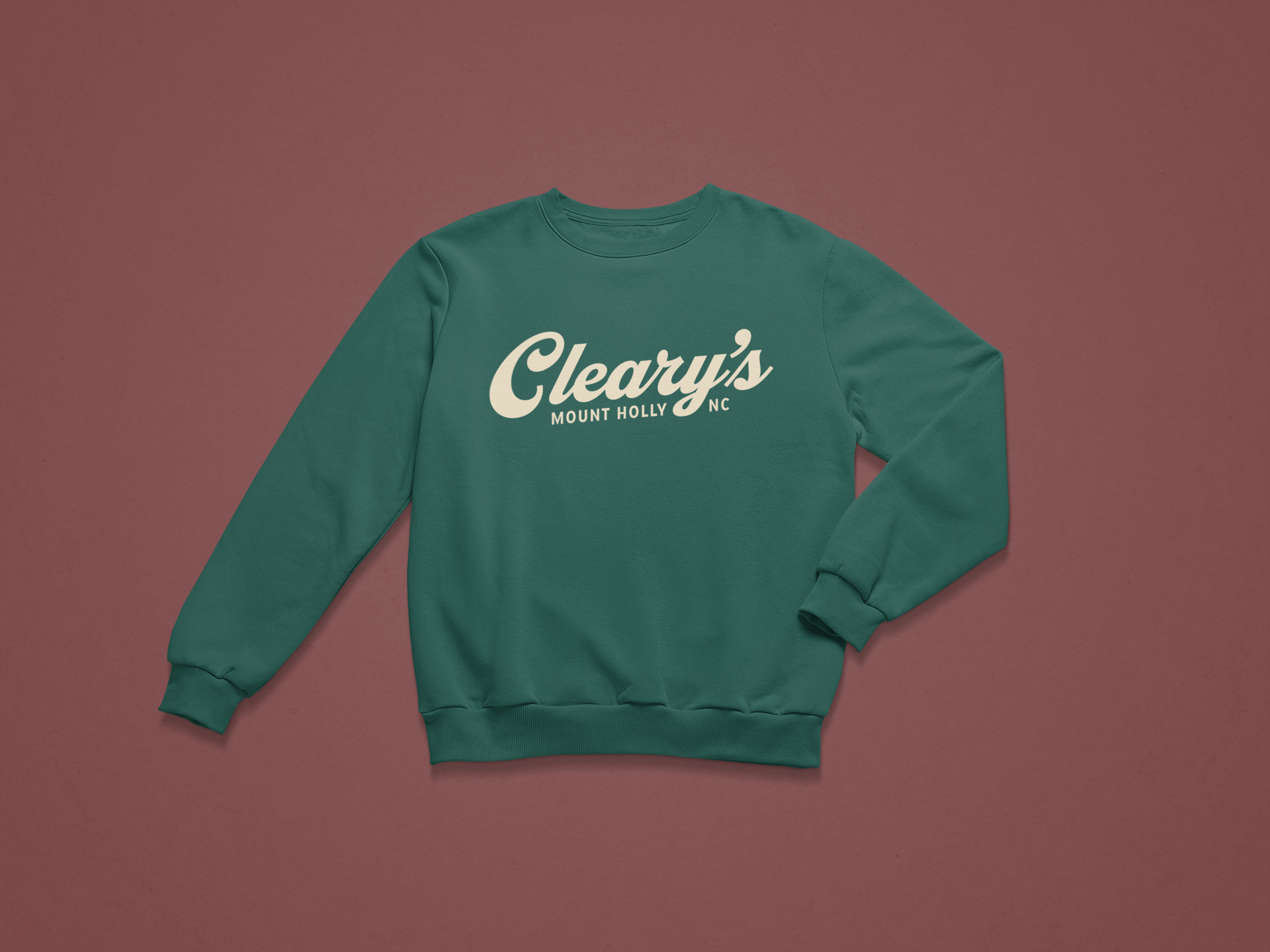
I developed a logo for Cleary’s Bookstore that draws on retro and vintage inspiration to create a sense of warmth and nostalgia. The client wanted the mark to feel inviting and approachable, reflecting the store’s mission of being a welcoming “third place” for the community. The logo also needed to work well in single-color applications and scale effectively for signage, print, and digital use.
Final Concept
The final logo combines classic typographic styling with subtle vintage detailing. Its retro aesthetic evokes familiarity and comfort, while the friendly letterforms reinforce the bookstore’s welcoming atmosphere. In addition to the core logo, a suite of branded swag—including tote bags, bookmarks, and tees—was developed to extend the identity beyond the storefront and give customers a tangible way to connect with the brand. Together, these elements create a timeless mark and brand system that feels both rooted in tradition and open to all, perfectly supporting Cleary’s role as a gathering place for readers and neighbors alike.
Skills:
Logo design
Marketing design